 Choosing a color palette for your project is one of the most important choices you will have to make. Whether you’re creating a flyer, promotional mail, retractable banners, or a giant billboard, customers are most likely to be captivated by the color. Based on a market study, color can boost brand recognition by 80%. Color choice is not something to be taken lightly!
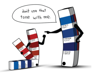
There are three main color models: PMS, CMYK, and RGB. PMS (the Pantone Matching System) is a standardized color reproduction system, that allows manufacturers in different locations to make sure colors match without direct contact with one another. PMS color 246C should look generally the same no matter where it’s printed. Most large brands use PMS colors so that their look stays consistent across multiple platforms.
CMYK refers to a color process where varying amounts of Cyan (C), Magenta (M), Yellow (Y), and Black (K) are used to create different colors. This is the preferred color process for most printing processes. When the four-color process is used, each shade is sent on the sheet individually and then fused together. When you look very closely at a printed CMYK process photo, you’ll noticed little dots of color printed over one another to create a solid image.


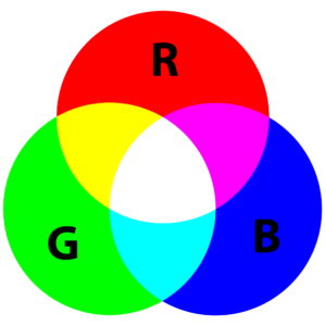
RGB refers to a color process where varying amounts of Red (R), Green (G), and Blue (B) are used to create different colors. This process is best for digital viewing – not print. When the three colors are maximized to 100% and then combined, you’ll get a solid white. Most images you’ll find on the internet are RGB, and will need to be converted to CMYK before printing. When in doubt, use CMYK!
So the next time you’re designing a logo, formatting a sales brochure, or just doodling on the computer, make sure you choose the color mode that best fits your application. Or you can always call the professionals at Impression Point and have them design it for you!
And you can always browse our new Resource Guide for tips, tricks, and all kinds of helpful hints!

